DESIGN PROCESS

DESIGN CONSIDERATIONS
We ensured the app to be easy and clear to use, as VR isn’t always easy to get a grasp of. The design offers easy navigation throughout the screens by offering minimal features. In relation to the VR aspect, we wanted to find 360 rooms that were as plain as possible so that the user could focus mainly on the content they added themselves.
PAPER PROTOTYPES
Below are the paper prototypes for the app design. I created different designs along the way, and tested them on Photoshop or Ilustrator as well as conducting user testing with fellow class mates.


SOFTWARE PROTOTYPES
APP DESIGN TEST
At first, we made a draft artboard of what the desires interface features

SIGN IN PAGE
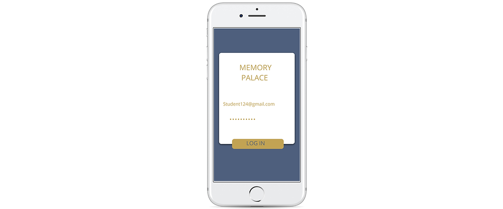
For the sign the sign in screen, I wanted It to be simple. At first, I used a yellow background with plain text. I decided to add more to the screen as I felt it was lacking something. I added different colours and a box to add the Sign In option. From there I knew I wanted some form of background image and a text box. After some brainstorming, I chose to use an outline of a castle with the text box over it. i added a sign up and forgot password option to stay within design principles.


LOAD PAGE
At first, I was going to use the outline of the castle on a background, however from looking up ideas I saw that a lot of apps have a plain background and the logo. I opted for a yellow background with the logo.
 |  |  |
|---|
MENU PAGE
For the menu page we looked up some inspiration for menu page designs as we weren't quite sure how to design it. At first we went for different shades of blue on an orange background. However after using testing, a white background was much preferred. I changed the colors to fit the final colour scheme.


As for the font on the rest of the interface, we chose Sans Serif as it Is clear and easy to use. The desired font was Opens Sans, however the Photoshop software was only available on the college grounds and didn't have the font on the software version. We went for Sans Serif as it was very similar to Open Sans.

For the Logo, we chose to use Open Dyslexic. It looked appealing and playful which was the desired design for the logo

At first we went for for a gold and royal blue to follow a ‘royal' theme relating to 'Palace'. However, with some user testing, the yellow was little too dark at first. I then tried a more of an orange but it was a little too bright. I opted for a slightly brighter shade of yellow. I was going to use the blue as a background, but the user testing also showed that the blue was too harsh. I chose to just use the blue for font and small features of the app.

VIRTUAL REALITY
360 IMAGE TESTING
Before we could begin working with 360 images, we needed to test their capabilities for VR.
Particularly, this included how to layer images on top of a 360 images, how the images stretched in a VR viewer, issues with image blurring etc.
The following are our initial tests.

Logo
We wanted to continue the royal theme, starting with a crown. After some brainstorming, we came up with the idea to make the logo an 'M', while making it look like the top of a palace would look.
 |  |  |
|---|
VR DESIGN
With testing completed, we could begin to place images into virtual reality spaces.
We simply layered PNG images onto 360 image backgrounds.
We had to be careful to place large images in the center and small images at the edges to avoid image stretching as much as possible, which would ruin immersion.
Overall, we created around 80 separate room images, mainly to provide users with more interactivity, as they have asked.
 |  |  |
|---|---|---|
 |  |  |
 |  |  |
 |
VR ROOMS

HOPE IS THE THING WITH FEATHERS
(ROOM 1)
This first room features example images relating to Elizabeth Bishop's poem "Hope is the Thing with Feathers".
Each image represents a different line in the poem. In the final app, these images would be customised by the user to be as memorable as possible.
Our users enjoyed this room for its warm atmosphere and rich surroundings though they wished for more interactivity.
HOPE IS THE THING WITH FEATHERS (ROOM 2)
This second room features example images relating to Elizabeth Bishop's poem "Hope is the Thing with Feathers".
This room represents the second paragraph of the poem while each image represents a different line in the poem.
This room has more complex imagery than the original room.
In the final app, these images would be customised by the user to be as memorable as possible.
Our users enjoyed the quirky images presented in this room although they felt they were difficult to decipher.


HOPE IS THE THING WITH FEATHERS (ROOM 3)
This third room features example images relating to Elizabeth Bishop's poem "Hope is the Thing with Feathers".
This room represents the final paragraph of the poem while each image represents a different line in the poem.
In the final app, these images would be customised by the user to be as memorable as possible.
Our users enjoyed this room's bright colours though they reported that it felt a little cramped.
DEMO
This is your Product Description. Write a short overview of the product including important features, pricing and any other relevant information for a potential buyer. Make sure the text is clear and easy to read. Tip from the pros: add an image of the product to give your customers a way of visualizing what you are selling.
